Bentley Motors unveils future-oriented 5th 'Bentley Wing' emblem design
|
A new appearance of the emblem, which is called "Bentley Wing" or "Winged B" and has become a symbol of Bentley with a 106-year history, has been unveiled. Along with the newly released fifth emblem, a concept car containing future vision and a new design studio at Crewe headquarters in the UK will be unveiled for the first time in July.
The Bentley emblem "Winged B," first created by F. Gordon Crosby in 1919, has been changing throughout 1931, 1990s and 2002. In particular, the fifth emblem is considered the biggest change in Bentley's history over a century, and is designed to intuitively recognize Bentley's identity.
The new emblem, created by Bentley's own design team under the leadership of Bentley Design General Robin Page, is the first step in opening a new chapter for the Bentley brand and its DNA. The new emblem, which contains confidence, meticulousness and creativity, symbolizes Bentley's dynamic future. In particular, the design proposed by Young Nam of the Bentley interior design team was finally adopted and later refined into a complete type.
The new emblem will be attached to the front of the future vision concept car, which will open a new origin for Bentley design. The concept car, which is scheduled to be unveiled on July 8, is not a mass-produced model, but presents Bentley's future design direction led by general manager Robin Page, and is inspired by the iconic Bentley model of the past.
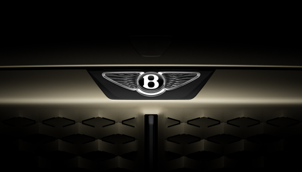
The goal of the new emblem design was to complete a more modern and progressive form while inheriting the beautiful details of previous emblems, such as diamond patterns inside the wings and centre Jewel with the 'B' logo. The new wing evolved to a sharper and more dramatic form than before, reminiscent of the angled wing of a hawk instead of a smooth curve. The feathers at the bottom of the 'B' logo disappeared completely, making it more visually concise.
The "B" center Jewel between wings can now be used independently without wings, reflecting the details found in luxury watch designs, adding elegance and depth.
"If luxury brands are the product of stories they have been making, the emblem is like a signature of a luxury brand, and redesigning the fourth evolution of the iconic 'Winged B' in Bentley's more than 100 years of history is an important work done with care," said Robin Page, Bentley's design director. "Simplification and refinement are essential elements in this modern era where complexity and precision are constantly advanced due to digitalization, and the new emblem, which gives a more concise, sharp, and intense impression than before, will be a new symbol that expresses Bentley's powerful and dynamic future."
History of Bentley Emblem
For the past 106 years, the identity of the Bentley emblem consisting of clear 'B' lettering in the center and wings surrounding both sides has remained unchanged. When W.O. Bentley first founded Bentley in 1919, he needed an emblem that symbolized his vision to break through the limits of performance.
Bentley asked F. Gordon Crosby, a friend and noted car illustrator, to design the logo, and Crosby produced the original "Winged B" emblem. The emblem was the addition of a pair of wings that symbolized the shudder of movement around Bentley's initials 'B', which was also a reflection of Walter Owen Bentley's history of designing fighter engines during World War I. Crosby designed the number of feathers on the left and right wings differently to prevent counterfeiting of the emblem.
The second emblem, newly created in 1931, was changed to a symmetrical design with 10 straight feathers placed on the left and right sides, and the 'B' logo was placed within a simple black ellipse. The second design has been used for more than 60 years, the longest-used version in the brand's history. The third emblem, which was born around 1996, returned the shape of the "B" center Jewel to a near circle in honor of Crosby's original design, highlighting decorative elements and curved wings.
After Bentley was acquired under the Volkswagen Group in 1998, the fourth emblem, newly designed in 2002, was unveiled in line with the birth of the first-generation Continental GT, which opened a new era for Bentley. Continental GT's new emblem, which boosted Bentley's annual sales from 1,000 to 10,000, returned to an asymmetric structure with 10 feathers on the left and 11 feathers on the right in honor of its 1919 prototype design, and has been used as Bentley's core brand identity to this day.
The new 'Bentley Wing' emblem will be officially unveiled for the first time on July 7, marking the opening of a new design studio at Bentley's headquarters in Crewe, England. Located in the former headquarters building built in 1938, the three-story design studio will be positioned as a key facility that presents Bentley's design direction in the future. Soon after, a new concept car with a new emblem will be unveiled on July 8.
This article was translated by Naver AI translator.