The secret of the McDonald's logo...Why yellow and red are used
May 05, 2025
|
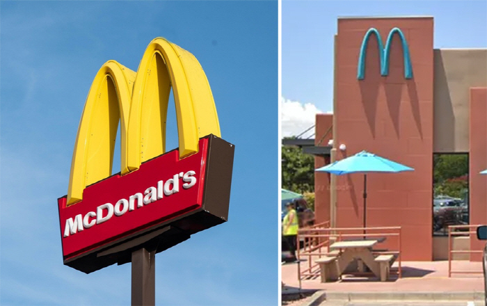
The McDonald's logo is a red square with a yellow 'M' hanging over it. It is also called 'Golden Arch'.
Color psychologist Karen Haller explained in an interview with British media outlet The Mirror that "red evokes stimulation, appetite, hunger, and yellow evokes feelings of happiness and friendliness.'
She also said that psychologically, this combination of colors is reminiscent of 'quickness'' speed' so that you can go in and eat quicklyIt is claimed to have the meaning of fast food ".
She said the yellow color of 'M in particular has two features, which naturally draw the attention and remind her of what is easily found on the road and the popular French fries (fried potatoes). The red square at the bottom can be called a French fry paper case, she said.
In fact, there are some places where the McDonald's logo is not yellow and red. One of them is in Sedona, Arizona, the United States.
The exterior of this store has a unique teal logo.
In 1993, the Department of Community Development pointed out that Sedona's tourism resources, red rocks, and yellow logos, were at odds.
In response to the city's 'oppression', McDonald's switched to teal. This makes it almost the only store in the world with the color of the logo.
On the other hand, McDonald's logo 'M' is derived from the initial letter 'M', but it is said that it originated from the exterior architectural element of the store at the time of its foundation.
This article was translated by Naver AI translator.
